
Gaultier’s Fashnost
Such was the prevalence of major fashion design houses in the mid-80s creating collections that incorporated Soviet themes and aesthetics, scholars at the Fashion Institute of Technology (FIT) coined the term “Fashnost”. The term is a combination of the words “fashion” and “glasnost”, which refers to the impact of social and political changes in the Soviet Union on fashion collections.
Jean Paul Gaultier’s Autumn-Winter 1986 collection is a significant example of ‘fashnost’, as it used Constructivist themes including Cyrillic lettering, block type, geometric shapes, and photomontage to reflect on the Soviet era’s sociopolitical climate.
Gaultier’s Russian Constructivist collection is a favourite of mine, for its bold graphical style. that draws inspiration from the visual language of the early 20th-century Russian Constructivist art movement. At a guess, anyone with a basic knowledge of Gaultier will be aware of this collection, along with 1993’s “Chic Rabbis” or 1996’s “Cyberbaba” collections.
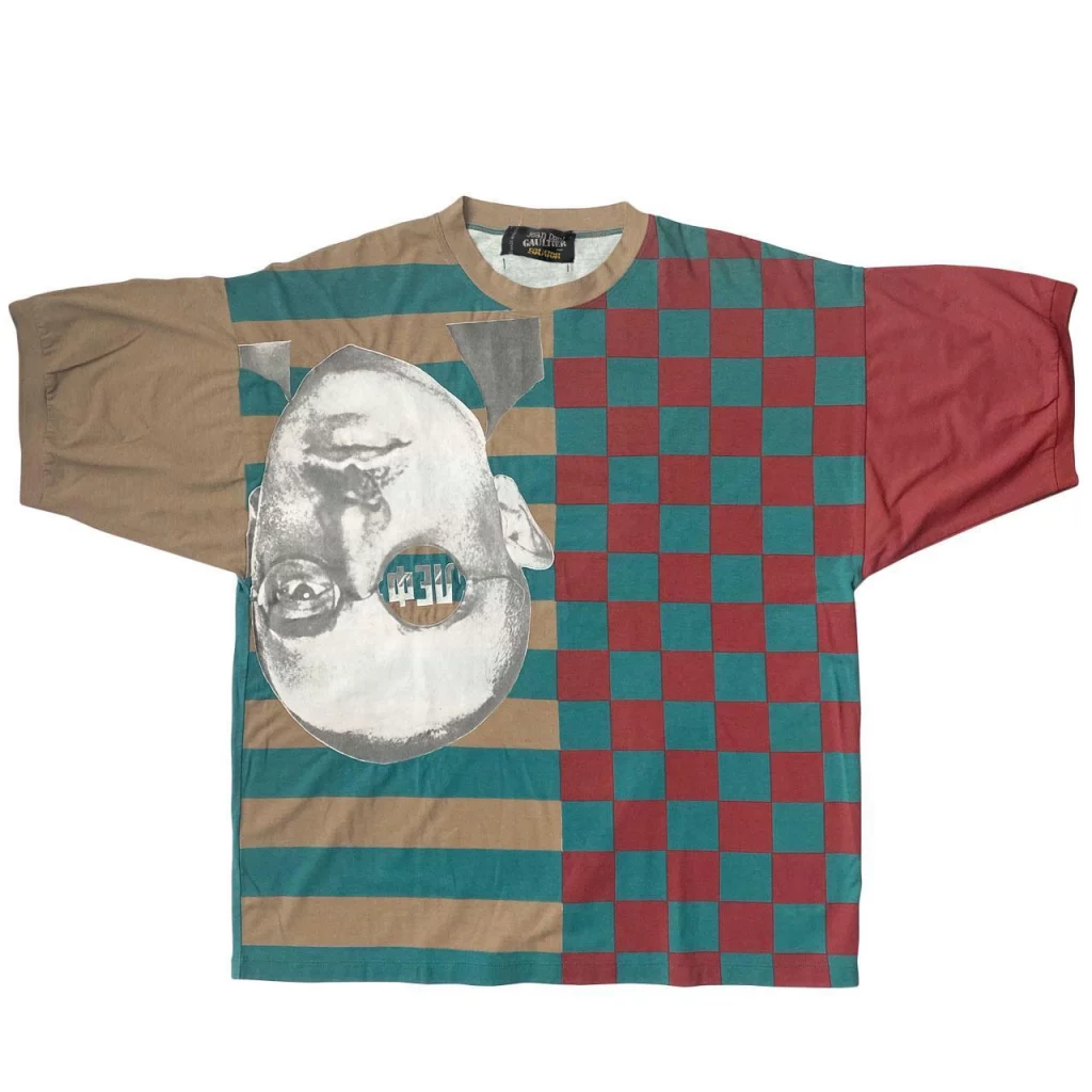
The collection is highly sought after by vintage collectors, as its innovative mix of fashion and modern art marked a significant period in Gaultier’s career, showcasing his talent in blending avant-garde fashion design with political and cultural commentary. Once seen, the bright colour blocks, Russian text, and graphic-heavy designs will stay in your mind forever, despite much of the collection being in black. I love the T-shirt designs from the collection, which were a result of the collaboration with the brand Equator, and how the photomontage and graphics capture the original spirit of Constructivism.
The design below features an image of Artist Alexander Rodchenko’s 1924 Portrait of Russian Avant-Garde Writer Osip Brik, with the letters “LEF” prominently displayed on Brik’s glasses, which refers to the Left Front of the Arts. This avant-garde group advocated for the integration of art into everyday life and the creation of socially useful art.
Social commentary in the Constructivism movement
Constructivism was a particularly austere branch of abstract art formed by Vladimir Tatlin in Russia around 1914, and according to the movement’s manifesto, “Constructivism is a purely technical mastery and organisation of materials.” Constructivists believed that art shouldn’t be produced for the art’s sake, but as a practice for social purposes.
As the Russian Revolution marked the beginning of communism, one of the founders of constructivism, painter and graphic designer Aleksander Mikhailovich Rodchenko, used his diverse skills to produce the iconic works of the movement. Teaming his graphic design skills with photomontages of his documentary style of photography, he used the resulting imagery as a tool for social commentary.
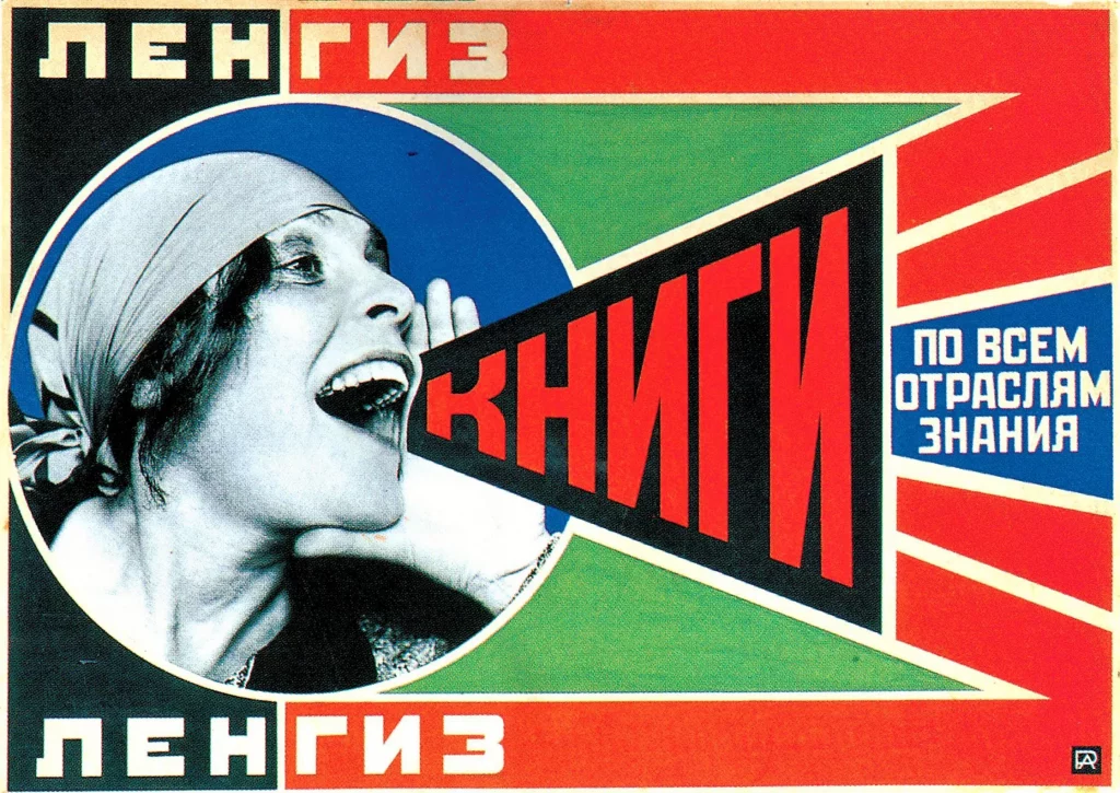
One of the most famous pieces of constructivist art is the 1924 poster “Books! Across All Branches of Knowledge” by Alexander Rodchenko. It was commissioned by LENGIZ, a state publishing house in Leningrad, to promote literacy and education to the public by encouraging them to read literature in various fields of knowledge.
Inspiration for the Russian Constructivist collection
In a video on the Fashion Mood Board website, Jean Paul reminisces on the Russian Constructivist show and the genesis of the collection.
“One of my assistants who used to do the printing for me had found a book on Russian Constructivism. When I saw the book, I was dazzled by the graphics, the posters, the universe it presented, and the colours. The colours were fabulous. My whole range of colours was around that.”
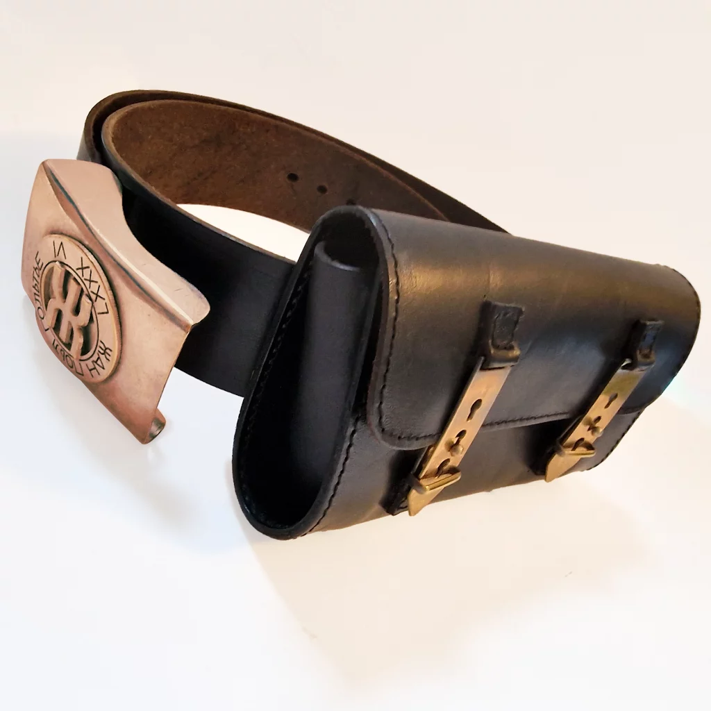
He discusses his use of metal as an accessory on the clothing, using both the Roman numerals LXXXVI representing the number 86 and Cyrillic letters, whose text “ЖАН ПОЛ ГОЛЬТЬЕ” translates to “Jean Paul Gaultier”. The use of Russian text, both as metal appliqué and in print, reinforces Alexander Rodchenko’s mixed-media style.
Suppose you look at the bold leather jackets from the collection or the images of Gaultier’s illustrator, Pauline Binoux. In that case, you’ll appreciate the statement shoulder pads and cinched waist, creating a broad, powerful silhouette. Gaultier attributes Thierry Mugler as the pioneer of the straight, wide shoulder, adding how his take on it was to have the shoulders drop slightly.
“The idea came from the ’50s jackets. Too big. It drops a bit. Me it was in the spirit of the thrift. One takes the clothing which is not at the right size. Women took men’s jackets, and the shoulder would fall off. There’s padding, but it’s not fully supported by the shoulder.”
Not all of the collection was a blaze of colour; more sombre cardigan bodies, zipped crotch bodysuits, and leather one-piece booted trousers had their part to play, especially as they employed new construction techniques.
The collection used an elasticated wool knit technique that had been developed by Anna Maria at Fuzzi SpA, a company founded in 1979 by the Fuzzi-Vitale family, producing knitting outerwear in quality materials like wool, mohair, alpaca, most of the time blended with polyacrylic and viscose. This material could be cut precisely, creating neat hems, and due to the way the material held itself, jackets didn’t require any lining.
One of my favourite items from the collection was constructed in soft neoprene and inspired by a fencer’s clothing. This bodysuit is fastened between the legs, and rather than having the metal cups that protect the breasts hidden inside pockets, Gaultier placed them on the outside as a decoration.
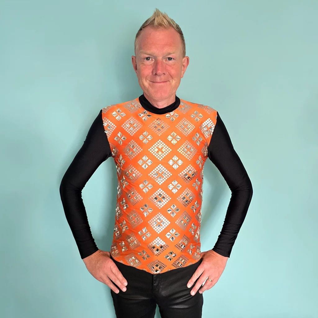
About the top
In this very bright orange with the whole front adorned with silver transfers and faux gems, I would never have guessed it was from the Russian collection. Watch the show and you’ll see a far more sedate black ensemble of the top and matching trousers. Although it could be a bodysuit, as Gaultier reminisces about wearing a bodysuit in the same design for the Cannes Film Festival and being refused entry!
I got this item very cheaply from a resale site, with the seller saying the charity shop they bought it from claimed it used to be Boy George’s.
The quality of this top, considering the fact that it’s made of lycra and has all these gemstones on is amazing. Only two of the square gems were missing, and after laboriously scouring the internet, I got some exact replacements. I also drilled tiny holes in the gems (and my thumb) so that they could be sewn on to match the existing ones, rather than glued on.
When Jean met Tanel
Obviously, the models play an important part in the shows, and one of the things I admire about JPG is the diversity on his catwalk. One such model who walked in the Russian show was Teri Toye, referred to as the first ‘out’ trans model, and the muse of Steven Sprouse, who opened his 1984 show.
The elusive Martin Margiela also makes an appearance in the show, while he was still interning for Gaultier. He’s the model sporting a HUGE metal belt buckle under a leather quilted jacket.
The star of the show has to be Gaultier’s long-term muse Tanel Bedrossiantz, who walked in numerous shows for the designer over several decades. Often camp, but conversely suave and macho, you’ve probably seen the photo of him in a velvet cone-bra dress from Gaultier’s Fall 1984 collection.
During the video, Tanel Bedrossiantz is referred to, with Jean Paul recounting the first time he met Tanel when he came into the Gaultier shop to do some shopping. JP loved his look, and his haircut and thought he was cute “in a way that I saw Farida or Edwige, it was love at first sight” it was perfect timing because he would be perfect in my fashion shows. “People I felt attracted to, by their walk, by their look, I would fall in love with them and would make them walk.”
In a Vogue article by Laird Borrelli-Persson, Tanel recounts his side of the story, which started with him visiting the Gaultier store in June 1985 to pick up a sample for Babeth Djian (the founder and editorial director of Numéro magazine), who at the time was employing him at Jill magazine.
“I had been there twice before, for the same reason. The third time was the charm; Gaultier saw me and I caught his eye. By the time I got back to Babeth with my packages, he had called her to say he wanted me for the men’s show (Joli Monsieur, 1985) and his advertising campaign.”
Gaultier and the Word Up album

If you take a look at the cover of American funk group Cameo’s Word Up album released in 1986, you’ll see artfully blurry examples of Gaultier’s Russian Constructivist collection. On the credits of the record, Gaultier is credited as providing the clothing and graphic artist and costume designer Toyce Anderson is credited as the stylist.
In a Video wishing Gaultier a happy birthday, Cameo singer Larry Blackmon credits Gaultier as having a lot to do with the band’s style and things that they did on the Word Up album. Blackmon remembers how Toyce Anderson went to Bloomingdale’s department store to select items from the collection to see if the band was interested in wearing them, and of course, they were.
The band ran into Jean Paul in London in September 1987, whilst they were playing at Wembley Arena, and Gaultier invited them to his show in Paris. Cameo’s Paris tour venue, Le Zénith, was across the street from the show, so the band went there to see his show, then invited JPG back to their after-show. A couple of days later, Gaultier invited the group to his showroom and gave them a part of the collection that the models had worn.
The skirt above is from the Russian Constructivist collection, released through the Public Gaultier line and the text on the skirt, ПУБЛИКА ГОЛЬТЬЕ, translates to Public Gaultier.